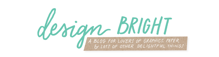
I’ve been spending the last couple of months reworking my company logo. I liked the old logo and was proud of it, but my business’s focus was transitioning and it was no longer a perfect fit for the brand. It was proving to be a little bit difficult to read, feeling a little flat and, well, designers are just plain fickle.
So it is out with the old and in with the new! Astute readers may have noticed the new logo has already been hanging out on the side panel of the blog for a little while now, but the logo has been finessesed and is ready to show the world!
A logo is of course not just about how pretty it is, but it needs to represent your brand. Before you create your brand marking, I believe it is important to verbalize exactly what your brand stands for and what you want your logo to project. Here’s what I came up with:
The words I’d use to describe my brand and business are: open, collaborative, hand-crafted, personalized and fresh. I’d like my logo to reflect those brand words as well as feel airy, handmade, bright, a little eclectic and feminine.
Here was some visual inspiration. I love calligraphy, water color, texture and fresh colors.
![]() bright side / merci / confidence / sunrise / studio / love / dancing / sun beam / do with love / happy / freckle
bright side / merci / confidence / sunrise / studio / love / dancing / sun beam / do with love / happy / freckle
So without further adieu…
![]()
![]()
What do you think? I’d love to hear from you!


Amazing work, as usual!!
I think you did SUCH a great job capturing all your branding descriptors.
Love it! :)